Page 1 of 1
The Logos for the Shirts that will Save Slalom
Posted: Fri Nov 19, 2010 3:00 am
by Erik Basil

Hey, I found a whole lotta logos. A Whole Lotta..
Link
Is the skateboard one in there "oh-fishal"?
Posted: Fri Nov 19, 2010 5:53 am
by Neil Orta
I was getting ready to ask the question "Is there an official logo for the ISSA or are we looking to generate a new one...." the t-shirt design is almost complete I am just waiting for one more photograph so I can get it complete and then the design will be ready to go to the board for approval and shirts will be done three weeks after that. JUST IN TIME FOR CHRISTMAS!!!
Posted: Fri Nov 19, 2010 7:38 pm
by Rick Floyd
are we getting issa rubber mallets to hit ourselves in the forehead with?
Posted: Sat Nov 20, 2010 4:23 am
by Neil Orta
not "we" Rick just you but they don't come with directions so I can operate it for you if you like

Posted: Sat Nov 20, 2010 4:25 am
by Rick Floyd
Neil Orta wrote:not "we" Rick just you but they don't come with directions so I can operate it for you if you like
yes please - 6 hits dead center, then one on the nose should do the trick...I'm wearing Fullbag protection though

Posted: Mon Nov 29, 2010 4:27 pm
by Neil Orta
Rick Floyd wrote:...I'm wearing Fullbag protection though
Obviously overkill in your case but better safe than sorry!

Posted: Mon Nov 29, 2010 8:19 pm
by Rick Floyd
Neil Orta wrote:Rick Floyd wrote:...I'm wearing Fullbag protection though
Obviously overkill in your case but better safe than sorry!
Wise ass...it's COLD up here...there's SHRINKAGE!
Posted: Tue Nov 30, 2010 2:02 am
by Stephen Lavin
That Idaho Self Storage Association one rocks...
Posted: Tue Nov 30, 2010 3:43 am
by Wesley Tucker
More like the Incessant S#&^t Storm Amalgamation.
Posted: Tue Nov 30, 2010 4:49 am
by Neil Orta
So is there a current "official" logo of the ISSA?
Posted: Tue Nov 30, 2010 5:06 am
by Wesley Tucker
Neil Orta wrote:So is there a current "official" logo of the ISSA?
Yes. It's currently on the home page three stories down. ISSA in a Machine-type script with a cyan cone through the middle.
A friend of Jani's did it in the '90s. Been the logo ever since. The CG files are here:
http://www.slalomskateboarder.com/phpBB ... php?t=6600
Posted: Tue Dec 07, 2010 5:25 pm
by Erik Basil
The logo in the downloadable packet is monochrome...maybe duo-tone if you play with it. That's it? That's the official logo?
Who can convert that thing into a large-sized image file for me?
Posted: Tue Dec 07, 2010 6:17 pm
by Rick Floyd
Erik Basil wrote:The logo in the downloadable packet is monochrome...maybe duo-tone if you play with it. That's it? That's the official logo?
Who can convert that thing into a large-sized image file for me?
If someone can get me a full-res 300 dpi RGB or CMYK color logo I'll make all the formats/sizes anyone could ever need out of it.
Posted: Tue Dec 07, 2010 6:23 pm
by Wesley Tucker
Erik Basil wrote:The logo in the downloadable packet is monochrome...maybe duo-tone if you play with it. That's it? That's the official logo?
Who can convert that thing into a large-sized image file for me?
Well, it is CMYK but it's only C and K. So it's a duo tone. Even if it was set up to run as CMYK there would only be two plates: C and K.
So what you got Erik is what there is.
Posted: Tue Dec 07, 2010 10:23 pm
by Jani Soderhall
I might have the logo in a different file format. Probably there's an EPS file somewhere. I'll go and look around once I get back home (probably only late next week).
Before we actually make anything out of it, maybe it should get a little refresher. let's discuss once I have looked around, so we know if we need to start from scratch or not.
/Jani
Posted: Wed Dec 08, 2010 12:35 am
by Neil Orta
I have begun "refreshing" the current logo and will share when finished to see what the general consensus is. I do not have time for an online virage of who likes what and will only make the changes I see as positive and then remake once from that, if not good enough then others can take it from there.
Posted: Wed Dec 08, 2010 3:30 pm
by Erik Basil
While you're working, a committee of one has prepared a tee-shirt using the existing logo:
http://www.slalomskateboarder.com/phpBB ... php?t=7679
Consider slalom saved. Now, for cancer.
Posted: Wed Dec 08, 2010 8:23 pm
by Robert Gaisek
I hate to say this but...........are we gonna use that old logo?
If we are updating ISSA overall.....maybe the logo too?
(yes, I think it is very 70-80....and yes, there are many much better ones in a thread about the subject)
http://www.slalomskateboarder.com/phpBB ... php?t=6527
Don´t hate me for this......I will buy one anyway, but maybe not wear it.
Posted: Wed Dec 08, 2010 11:25 pm
by Neil Orta
Not a new logo just update of the old one....
Posted: Thu Dec 09, 2010 12:35 am
by Rob Ashby
We spent many, many hours deliberating on the new logo for the UKSSA especially when it came to the shape of the S's! Then we spent even time more deciding on the colours - it is no easy task to please everyone - but there is always room for a bit of compromise!
Neil, I noticed on your new design logo that you have re-named the International Slalom Skateboarding Association by changing the meaning of the S's to "Skateboard" and "Slalom. Or was this an accident?
Posted: Thu Dec 09, 2010 2:37 am
by Pat Chewning
Rob Ashby wrote:Neil, I noticed on your new design logo that you have re-named the International Slalom Skateboarding Association by changing the meaning of the S's to "Skateboard" and "Slalom. Or was this an accident?
The Europeans for some reason like to call the ISSA "International Skateboard Slalom Association". I think it might have something to do with the normal order of nouns/adjectives in the language??
The common American/English way is "International Slalom Skateboarding Association"
Our official Constitution/Bylaws calls it "International Slalom Skateboarding Association"
ARTICLE I: NAME
The name of this organization shall be the International Slalom Skateboarding Association (ISSA).
PS: I like the update to the logo and I'm even more fond of some of the proposals with a picture of an actual racer.
Posted: Thu Dec 09, 2010 2:51 am
by Neil Orta
It was more that I was in a hurry that I swapped the words around, meant nothing by it and it is an easy fix. I have been looking for a good picture that will translate well to a high contrast image that will print in black and white to add to it but basically wanted to get some feeback on the lettering before I went any further.
Posted: Thu Dec 09, 2010 5:58 pm
by Rick Floyd
oh no, not "logo-gate" again...did anyone notice Erik's nice post about the shirts??
Posted: Thu Dec 09, 2010 6:15 pm
by Robert Gaisek
Yes....it was a nice post.....but the logo is still a bit lame if we want to remake ISSA to something that attract more racers....a great logo will make a difference for sure.
Posted: Thu Dec 09, 2010 6:16 pm
by Ron Barbagallo
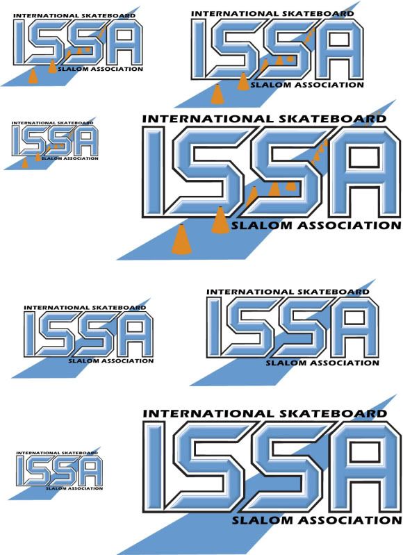
I like the logo with the cones
And I noticed Erik's post AND the fact that he has already set it up AND posted in on Silverfish. Wish we could nominate him for BOD!
Posted: Thu Dec 09, 2010 6:42 pm
by Erik Basil
Hey, come up with a better logo and the same thing can happen for the new logo in another 15-minutes of effort on my part.
The point I sought to make is one I'd posted on earlier: you want an ISSA shirt? Easily done. No upfront costs, no mailing, no grief, not much profit, no losses. Bada bing, bada-boom.
Do you guys like Neil's update of the original? Let me know and I'll revise the shirt (send me an EPS, Dr. No) in a jiff.
Posted: Thu Dec 09, 2010 9:59 pm
by Neil Orta
I am in process of adding more detail but should be ready to send the file on Monday.
Posted: Sat Dec 18, 2010 3:30 pm
by Erik Basil
Do it, and I'll update the shirt design.
Posted: Sun Dec 19, 2010 4:01 pm
by Glenn Bukowsky
Thanks Erik & Neal! Good work, but I'm with the Fat Bastard on this one.
Need a more flashy & illustrative logo for the 2000teens.
Don't get me wrong, don't see why we can't have the traditional logo AND a new updated, crisper one.
my 2 cents.
Posted: Sun Dec 19, 2010 10:18 pm
by Robert Gaisek
Maybe merge one of the new ideas with the old one?